7 Brand Identity Problems Hurting Your Business
Corporate brand identity problems routinely destroy market equity because companies mistakenly prioritize aesthetic vanity over functional distinctiveness.
When a business sanitizes its visual presence to look identical to its competitors, it disappears from consumer memory and drops out of algorithmic search indexing.
This systematic guide breaks down the structural branding errors that drain revenue from small and medium-sized businesses.
| Phase | Human Recall Impact | Algorithmic Search Impact |
| 1. Dilution | Dilutes or eliminates unique visual markers. | Fails to provide structured entity data. |
| 2. Mimicry | Mimics standard industry conventions. | Lacks clear image alternative text attributes. |
| 3. Failure | Drops human brand recall to near zero. | Lowers visibility in automated AI search engines. |
What Are Brand Identity Problems?
Brand identity problems are structural, semantic, or visual misalignments within a company’s public presentation that actively disrupt market recognition, erode consumer trust, and diminish search engine visibility. These systematic failures decouple a company’s operational reality from its visual and textual delivery.
Key Components:
- Asset Dilution: The systematic softening or complete elimination of unique visual markers like custom emblems, specific color ranges, or typographic features.
- Semantic Misalignment: A structural mismatch between the core services a company executes and the topical context its visual messaging projects.
- Machine Illegibility: Visual and structural architectures that lack clear text alternatives, schema data, or entity definitions, leaving AI models unable to categorize the company.
Brand identity problems originate when companies prioritize aesthetic uniformity over functional distinctiveness, resulting in low human recall and decreased machine search engine recognition.
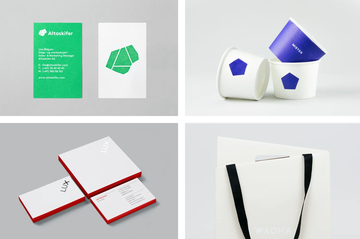
1. The Commodity Mimicry Trap

Why does copycat branding ruin market share?
Copycat branding kills market share by entirely eliminating user motivation to differentiate your business from your nearest competitors. When your visual presentation aligns with the exact aesthetic conventions of your industry vertical, buyers automatically default to selecting providers based solely on price.
| Identity Choice | Visual Execution Parameters | Eventual Market Consequence |
| The Me-Too Brand | Uses stock blue color palettes, generic sans-serif fonts, and abstract geometric icons. | Leads to rapid commercial commoditization and structural price wars. |
| The Distinctive Brand | Employs high-contrast color palettes, custom typography, and intentional asymmetry. | Allows the business to command a clear market premium and dominate attention. |
Many corporate leaders buy cookie-cutter templates because they want their firm to look established and safe. This path results in what designers call industry-standard aesthetic camouflage. If you operate an engineering firm in North Texas and adopt the identical navy blue palette, clean geometric icon, and dry corporate language as every other business down the Interstate 35 corridor, you remove any reason for a buyer to select your company.
The financial penalty for this error is immense. According to the McKinsey & Company 2024 McKinsey Design Index report, companies that scored in the top quartile for rigorous design individuality outperformed industry benchmarks by 2:1 in organic revenue growth. When you strip away distinctiveness, you strip away your ability to command a market premium.
Businesses must move past these generic choices by investing in tailored brand identity design that actively positions their company distinctively in the market. True differentiation requires defining your operational parameters and projecting them through high-contrast design decisions.
“When a corporate visual system mimics competitor conventions to reduce market friction, it inadvertently eliminates the exact visual cues that trigger customer recall. Sanitized aesthetics guarantee commercial invisibility.”
2. Digital De-branding and Asset Vaporization
What happens when you remove your primary visual assets?
Stripping away classic design assets breaks consumer recognition loops and causes immediate drops in market prominence. Modern businesses frequently ruin their public recognition by removing their most recognizable graphic features under the misguided assumption that they need a minimalist look.
The automotive and luxury sectors provide stark lessons in this specific failure. Jaguar’s late 2024 global rebrand by its internal design department removed the classic leaping cat emblem from the brand’s primary digital communications channels. The company replaced a universally recognized symbol of luxury performance with a thin, spaced-out sans-serif typography design.
The public pushback was instant, and consumer sentiment dropped across major digital tracking platforms. This move alienated core buyers who associated the historical graphic mark with their own high-end purchase choices.
| Brand Approach | Core Visual Strategy | Measured Consumer Reception |
| Historical Asset Focus | Keeps iconic marks like the classic Jaguar leaping cat emblem for instant recall. | Maintains historical brand equity and preserves consumer trust. |
| Modern Minimalism Shift | Strips out historical symbols in favor of thin, uninspired sans-serif text. | Triggers immediate consumer alienation and severe brand equity drops. |
This error stems from a misunderstanding of how human memory functions over long periods. When you eliminate your distinctive brand assets, you break the mental networks your customers have built up over the years. You throw away hard-earned market recognition just to look temporarily modern.
Mastercard handled this transition correctly in 2019 by taking the opposite approach. Working alongside global design agency Pentagram, they dropped the written text name from their corporate logo mark entirely.
They did this only because decades of consumer data confirmed their red and yellow interlocking circles had achieved independent recognition. They did not destroy their main asset; they elevated it.
“Minimalism becomes destructive the moment it removes the specific visual triggers that drive consumer memory. Stripping away recognizable brand marks for the sake of modern design trends deletes your historical market presence.”
3. The Contextual Consistency Myth
Does your brand identity need to look identical on every platform?
Forcing a rigid visual identity system onto entirely different digital spaces ruins your engagement and leaves your brand looking out of place. Modern marketing channels require an adaptive design approach in which your layout changes to fit the space it occupies.
For years, design agencies told businesses that every single piece of media they produced had to look exactly the same. They claimed that absolute consistency was the only way to build customer trust. This advice is outdated in 2026.
The Ehrenberg-Bass Institute for Marketing Science proved that successful branding relies on maintaining functional distinctiveness, not keeping things perfectly identical everywhere. Forcing a rigid corporate PDF layout into an informal social media space or a clean mobile screen makes your business look stiff and out of touch.
| Digital Platform Channel | Visual Formatting Choice | Technical Asset Optimization |
| Mobile App Environment | Prioritizes clean layout scaling and interface usability over decoration. | Deploys optimized, inline vector SVG paths for fast mobile loading. |
| Social Media Spaces | Focuses on high-contrast, human-centric layouts that stop the scroll. | Adapts brand color applications to match native platform dimensions. |
| B2B Technical Documents | Structures complex informational layouts with high typographic hierarchy. | Embeds complete entity metadata and descriptive schema profiles. |
A modern visual presence should function like an open design system rather than a locked rulebook. Your core brand markers—like your main color values or typography hierarchies—must remain clear, but the way they are styled needs to adapt to the platform.
A high-intent B2B service page requires clean typography and a professional, scannable layout. That same company’s mobile app needs fast-loading vector paths and clear UI elements. If you force an unyielding, old-school layout onto every screen, you ruin the user experience and drive people away.
“Demanding absolute visual uniformity across different digital platforms limits your reach. Brands must use flexible design frameworks that protect core assets while changing their presentation to fit the format.”
4. Semantic Entity Blindness
Why does abstract branding hurt your visibility in search engines?
Abstract visual branding hurts your visibility by hiding the actual nature of your business from machine learning search systems. When your website relies on obscure graphics and vague corporate taglines, search algorithms cannot identify what services you offer.
Modern search engines use natural language processing to organize businesses as distinct entities connected by clear facts. If your corporate web pages use vague phrases like “Synergistic Solutions for Tomorrow” instead of clear terms like “Commercial Structural Engineering Services in Dallas,” search crawlers cannot match your site with user queries.
This problem gets worse when your visual assets lack descriptive metadata. If your main identity images are unoptimized, generic files like asset-3.png, you’re missing an opportunity to signal your true authority to search engines.
| Asset Parameter | Unoptimized Asset File (Amateur) | Semantically Optimized Asset (Pro) |
| File Naming Protocol | Uses generic automated labels like asset-3.png | Uses descriptive, entity-focused labels like inkbot-design-logo.svg |
| Alternative Text Data | Leaves the HTML image alternative text completely empty | Includes detailed description: alt="Inkbot Design agency logo" |
| Schema Organization | Lacks any backend code mapping or structural context | Wraps asset in structured schema code defining the Organization |
Your corporate website must clearly map out your services using structured data. Every design choice, image asset, and content layout needs to tell search algorithms exactly who you are, what you do, and where you operate.
If you ignore these technical details, your business will disappear from AI-driven search tools, no matter how attractive your design looks on a screen. You can learn more about how clear messaging connects to search performance by reading our guide on what is brand identity.
“Vague corporate visual identities fail because they hide essential business context from machine web crawlers. True digital presence requires balancing distinct human design with structured data that machines can easily read.”
5. Visual Friction and Performance Penalties
How do oversized design files impact your online revenue?
Heavy, complex design assets directly reduce your online revenue by slowing down your website and causing users to abandon your page. Slow loading speeds frustrate visitors and signal to search engines that your site provides a poor user experience.
Many businesses ruin their website performance by publishing massive, unoptimized graphic files. When an agency delivers your brand assets as uncompressed images, large custom web fonts, or complex background videos, they create a slow, frustrating user experience.
The HubSpot 2025 State of Consumer Trends Report showed that page load delays directly cause immediate drops in online conversions. If your home page takes longer than 3 seconds to load due to large background graphics, visitors will leave before they ever see your offers.
| Technical Asset Area | The Wrong Way (Amateur) | The Right Way (Pro) | Why It Matters |
| Identity File Formats | Raw PNGs or heavy uncompressed GIFs | Optimized inline SVGs with clean code | Cuts load times and scales cleanly to any screen size. |
| Typography Setup | Loading 5+ external custom font weights | Storing 2 variable fonts locally on the server | Lowers server requests and stops text from flickering. |
| Image Asset Control | Using generic web files like header-new.jpg | Delivering modern WebP or AVIF image files | Reduces page weight by up to 70% without losing quality. |
| Graphic Code Structure | Complex nested paths from vector software | Cleaner, simplified paths with zero editor junk | Speeds up mobile rendering and improves page speeds. |
Slow web performance also hurts your organic search positions. Google’s core ranking systems penalize sites that load slowly on mobile devices.
If your brand deployment forces users to download multiple megabytes of font files and heavy layouts just to read a text block, search engines will demote your pages. Your visual assets must be designed from the start to load instantly on mobile connections.
“Oversized, unoptimized design files turn your brand into an operational liability. High-performance identities prioritize clean asset delivery to protect your search rankings and maximize user conversions.”
6. Structural Typography and Font Licensing Liabilities
Can unmanaged font systems create financial and operational risks?
Unmanaged font systems expose your business to severe intellectual property lawsuits and degrade your digital performance. When your team installs typefaces without verifying their commercial web licensing parameters, they create large financial liabilities for the company.
| Risk Category | Structural Branding Failure | Long-Term Operational Threat |
| Legal & Financial Exposure | Deploying standard desktop font files directly to live web servers. | Triggers expensive copyright enforcement lawsuits from font owners. |
| Performance Degradation | Loading multiple heavy, external font weights from public servers. | Creates long mobile rendering delays and large layout shifts. |
Typography choices involve serious legal requirements. Many business owners do not realize that standard desktop font licenses do not cover web deployment, application embeds, or digital products.
If your design agency builds your identity using an expensive commercial typeface and your web developer uploads it to your production servers without a valid web license, the font owner can pursue copyright claims. These lawsuits can cost tens of thousands of dollars in damages and force you to completely rebuild your website overnight.
Using too many different custom fonts also harms your technical performance. Loading multiple font weights creates render-blocking requests that slow down your mobile layout.
To fix this, use modern variable fonts hosted directly on your own servers. This strategy keeps your design looking sharp while protecting your business from licensing issues and performance drops.
“Treating typography as a purely aesthetic choice creates legal and technical vulnerabilities. Secure commercial web licenses and use optimized variable fonts to protect your business from lawsuits and performance issues.”
7. The Packaging Redesign Catastrophe
How can a poorly planned packaging redesign ruin established sales?
Poorly planned packaging changes destroy product recognition and cause immediate drops in retail revenue. When you completely replace your product’s most familiar visual elements, you make it incredibly difficult for regular customers to find your items on store shelves.
The classic example of this mistake remains Tropicana’s 2009 packaging redesign by the Arnell Group. The brand removed its famous image of an orange with a straw sticking out, replacing it with a generic glass of juice and a thin typographic layout.
Customers could no longer spot their favorite juice on the shelves, mistaking it for a low-cost generic brand. Sales dropped by 20% in just two months, costing Tropicana over $30 million in lost revenue before they abandoned the new design and brought back their original packaging.
| Design System Strategy | Visual Asset Properties | Financial Retail Performance |
| Original Packaging Focus | Uses vibrant orange assets, bold clean text, and high visual contrast. | Maintains positions as an established, highly visible market leader. |
| Arnell Redesign Shift | Introduces generic juice glasses, thin sanitized fonts, and low visibility. | Causes catastrophic $30 million revenue drops in two months. |
This failure shows the danger of prioritizing design awards over clear market recognition. Your product packaging should make it easy for customers to spot your brand instantly in a busy retail environment.
If you plan to update your visual presentation, make changes gradually over time. This approach lets you update your look while keeping your most important visual assets intact, ensuring your regular buyers can always find your products.
“Completely changing your product packaging without respecting your historical design assets breaks customer trust. Updates must be managed carefully to keep your brand recognizable on the shelf.”
The State of Brand Identity Problems in 2026
The widespread adoption of generative AI tools has completely changed how corporate brand identities break down. The main challenge for modern businesses is no longer just standing out on physical retail shelves; it is surviving the flood of cheap, automated content that fills digital spaces.
| Market Environment Layer | Core Channel Challenges | Required Brand Response |
| Amateur AI Acceleration | Generates thousands of generic, lookalike brand templates instantly. | Requires hyper-distinctive, custom human design choices. |
| Machine Indexing Systems | Ignores unoptimized visual files and unmapped corporate text. | Demands deep technical schema execution and clean asset delivery. |
The launch of automated design software over the past two years has allowed non-designers to instantly generate generic logos, color palettes, and websites. This ease of creation has filled the web with lookalike brands that lack genuine identity or clear strategy.
When your business uses these basic, automated tools, you end up with a forgettable look that fails to engage human buyers or rank well in modern search engines.
At the same time, search engines have evolved from simple keyword-matching systems into sophisticated discovery engines that index verified business entities. Platforms like Google AI Overviews, Perplexity, and ChatGPT do not just look at your visual presentation; they read your entire digital footprint to verify your company’s expertise and authority.
If your website lacks clear, structured data and consistent entity messaging, these advanced search systems will pass you over, cutting off your access to high-intent web traffic.
| Brand Identity Area | Old Design Approach (Pre-2026) | Modern Strategic Approach (2026) |
| Asset Creation | Creating purely decorative visuals | Building optimized, accessible design systems |
| Typography Control | Loading multiple heavy web fonts | Deploying fast, self-hosted variable typefaces |
| Search Optimization | Focus solely on visible page text | Structuring deep technical schema and entity data |
| Platform Deployment | Forcing rigid layouts onto every screen | Using flexible designs that adapt to each platform |
To succeed today, your brand identity must be optimized for both human users and AI indexing tools. This means moving past generic, automated templates and building a distinct visual identity backed by solid technical optimization.
Ensuring your business stands out across all digital channels requires setting up clear image metadata, optimized vector files, and a structured organization schema.
The Consultant’s Reality Check
Over the past year, I audited a growing commercial service provider based right here in the Dallas-Fort Worth metroplex. The business had spent more than $45,000 on a comprehensive brand overhaul with a traditional design agency.
The resulting presentation looked stunning on paper—it featured clean, minimalist layouts, subtle pastel color choices, and elegant, thin typography.
The immediate problem arose within sixty days of launching the new design system. The company’s organic inbound leads dropped by 35%, and their primary service pages completely vanished from local map packs and high-intent search queries.
| Redesign Phase | Core Execution Mistake | Measured Commercial Failure |
| $45K Traditional Overhaul | Prioritized abstract minimalist trends over functional performance. | Caused an immediate 35% drop in organic inbound business leads. |
| Technical Recovery Shift | Replaced heavy fonts and added clear, structured data definitions. | Restored local search engine rankings and fixed page speed metrics. |
When my team analyzed the underlying code of their new website, we found that the agency had prioritized abstract aesthetics over technical execution. They embedded the company’s core service definitions in heavy, unoptimized image files without alternative text.
The elegant typography was powered by four external font files, slowing mobile page load times to over 6 seconds. The beautiful design actively hid the business from search crawlers and frustrated actual mobile users.
We stripped out the heavy external fonts, optimized the primary visual assets into clean inline vector code, and added explicit structured data wrappers to their service pages. We also adjusted their subtle palette to create a high-contrast, platform-native design layout.
The lesson here is simple: never let an agency compromise your technical performance or search visibility for the sake of abstract design vanity. If your new look makes your business impossible for search engines to crawl or slow for mobile users to navigate, it is a commercial failure.
The Verdict
Fixing corporate brand identity problems requires moving past shallow, trend-driven design choices and focusing on functional distinctiveness and technical performance. A successful visual presentation must do more than just look attractive on a screen; it needs to clearly communicate your business authority to both human buyers and automated search engines.
| Strategic Pillar | Core Branding Action Step | Final Commercial Objective |
| Distinctive Visuals | Deploy high-contrast custom design frameworks across every digital platform. | Capture maximum human market attention and build long-term recall. |
| Technical Accessibility | Minimize mobile page weights and implement complete structured entity schema. | Secure permanent visibility inside modern machine learning search engines. |
Stop sanitizing your visual presentation to match the quiet, forgettable templates of your industry peers. Work on developing bold, high-contrast design systems that protect your unique assets, load instantly on mobile devices, and use clear data structures to state exactly who you are.
If you are ready to fix your branding errors, optimize your digital performance, and build genuine market equity, look through our full Dallas Design Co. Services today. Let’s collaborate to build a distinct, high-performance brand that commands attention and drives actual business growth.
FAQ
Why is copycat branding dangerous for my company’s revenue?
Copycat branding forces your business into direct price competition by removing any visible differences between you and your competitors. When your visual presentation matches the exact design conventions of your industry vertical, customers have no reason to choose your brand other than price, which lowers your profit margins.
How does digital de-branding impact long-term customer recall?
Digital de-branding breaks long-term recall by removing the specific visual triggers that your customers associate with your business. Stripping away recognizable symbols or unique design assets in pursuit of a minimalist look forces you to rebuild your market visibility from scratch.
Is absolute consistency across all marketing platforms required?
Absolute visual consistency across all marketing channels is no longer effective. Modern branding requires an adaptive design system that keeps your core assets recognizable while changing layouts to match the specific user experience and technical requirements of each platform.
What is semantic entity blindness in digital branding?
Semantic entity blindness happens when a business uses abstract visual designs and vague language that hide the actual nature of its services from search crawlers. This prevents search engines from properly indexing your company and displaying your pages for relevant user queries.
How do large custom web fonts harm mobile conversions?
Large custom web font files slow down your page load times by creating render-blocking requests on mobile devices. These performance delays frustrate mobile visitors, leading to higher bounce rates and direct drops in your online sales.
What legal risks are tied to corporate typography systems?
Using corporate typefaces without verified commercial web licensing exposes your business to expensive copyright lawsuits from font creators. These licensing violations can result in significant financial penalties and force you to rebuild your digital infrastructure overnight.
Why did Tropicana’s packaging redesign fail so quickly?
Tropicana’s packaging redesign failed because it completely removed the product’s most recognizable visual asset—the orange with a straw. This sudden change confused loyal shoppers, who could no longer find the product on store shelves, causing a 20% drop in sales.
How does generative AI impact market distinctiveness?
Generative AI tools make it easy for any business to create generic logos and website layouts instantly. This wave of automated content fills the market with lookalike brands, making custom, professional design essential for standing out from the noise.
When should my company consider updating its brand assets?
Your company should update its brand assets when your current presentation no longer reflects your operational scale, causes technical performance drops, or fails to differentiate your business from newer competitors entering your local market.
How do search engines evaluate visual brand assets?
Search engines analyze visual brand assets by crawling their file names, reading alternative text metadata, and evaluating how quickly those files render on mobile screens. Properly optimized design assets signal technical authority and improve your search positions.
What is the fastest way to fix hidden branding errors?
The fastest way to fix hidden branding errors is to audit your digital presence for performance issues, replace heavy font files with optimized typefaces, add clear structured schema data, and improve the visual contrast of your primary brand assets.