Website Conversion Rate Optimization That Drives Better Leads
Website conversion rate optimization works best when we define the right conversion first, identify friction with data and user research, test one clear hypothesis at a time, and judge results by lead quality, revenue, and profit rather than clicks alone.
 By Tabitha Ayers8 min read

Website conversion rate optimization is the disciplined process of improving the percentage of visitors who take a meaningful business action. For a small business, that action might be a completed purchase, a qualified consultation request, a demo booking, or a phone call from the right prospect.
The distinction matters. A higher conversion rate is not automatically a sign of a healthier business. If a form becomes easier to complete but produces low-quality leads, sales teams may spend more time filtering inquiries while revenue stays flat. Effective CRO improves the path from visitor intent to business value, not just the number displayed in an analytics dashboard.
Define The Conversion Before Optimizing It

Choose A Conversion Unit That Matches The Decision
The standard calculation is straightforward:
The difficult part is defining the audience. Businesses often use visitors, users, and sessions interchangeably, but each answers a different question.
Conversion Question | Useful Numerator | Useful Denominator | Why It Helps |
|---|---|---|---|
How well does a landing page persuade new prospects? | Completed lead form | Unique users who viewed that landing page | Limits repeat visits from inflating the audience |
How efficient is a checkout flow? | Completed orders | Checkout sessions | Focuses on people who actually entered the purchase process |
How effective is paid search traffic? | Qualified leads | Ad-driven sessions or users | Connects campaign investment to the relevant audience |
How healthy is the sales pipeline? | Sales accepted opportunities | Qualified inquiries | Avoids treating every form completion as equal |
There is no universal best denominator. We should select one that remains stable across reporting periods and aligns with the decision at hand. If an executive asks whether a new service page produces more inquiries from prospective clients, page users may be appropriate. If the real concern is whether checkout abandonment has improved, checkout starts may be more useful.
Fair warning: changing the denominator midstream can create a false impression of improvement or decline. Document the conversion event, audience, date range, attribution rule, and exclusions before comparing results.
Separate Microconversions From Business Outcomes
A microconversion is an intermediate action: a pricing page view, an add-to-cart event, a brochure download, a video play, or an email signup. These actions are useful because they show where interest builds or drops. They should not automatically become the primary goal.
A macroconversion is the core business outcome, such as a completed order, qualified opportunity, booked consultation, or paid subscription. Website conversion rate optimization should keep this outcome in view.
Consider a B2B consulting firm that shortens its inquiry form from nine fields to three. Form completions may rise. That is promising, but the team still needs to check whether submitted leads fit the target market, attend calls, and enter the pipeline. If qualification falls sharply, the simplified form may have shifted work from the visitor to the sales team rather than creating net value.
A practical measurement model uses both levels:
- Primary metric: qualified consultation requests per eligible visitor.
- Diagnostic metrics: form starts, error rates, field abandonment, and CTA clicks.
- Guardrail metrics: lead acceptance rate, refund rate, average order value, margin, or unsubscribe rate.
This structure gives teams permission to improve the user experience without rewarding empty activity.
Make The Value Proposition Clear Before Testing Details
CRO is often reduced to button wording or page color. Those details can matter, but they rarely overcome unclear positioning. Visitors need to understand what the business offers, who it serves, why it is credible, and what should happen next.
For professional services firms, the question is often not “Should the button be purple or blue?” It is “Does this page explain why a decision maker should trust this firm with a high consequence decision?” A page that leads with vague claims about excellence may attract attention but still fail to reduce perceived risk.
Strong website copywriting services can drive conversions by giving visitors a clear problem, a specific outcome, evidence of relevance, and a logical next step. The page should answer practical concerns before asking for commitment.
Find Friction In The Conversion Path

Start With Funnel Analysis, Not Assumptions
A conversion funnel shows the steps visitors take from arrival to completion. For an ecommerce site, the path may move from product page to cart to checkout to payment confirmation. For a service firm, it may move from landing page to service page to contact form to scheduled consultation.
Start by measuring the drop between major steps. A high exit rate on a homepage is not necessarily a problem if visitors arrive seeking a phone number and find it quickly. But a large drop after visitors click “Request a Consultation” suggests a closer review of the form, scheduling tool, page load, or message match.
Use segmentation carefully. Compare behavior by device type, traffic source, landing page, geography where relevant, and new versus returning visitors. Averages can hide important differences. Mobile visitors may abandon a form because a calendar widget does not work well on a touchscreen, while desktop users proceed without issue.
At the same time, avoid treating every segmented result as proof. If a team reviews dozens of segments, some apparent differences will occur by chance. Use segment findings to generate hypotheses, then confirm them with enough data or direct user evidence.
Pair Behavioral Data With User Evidence
Analytics tells us where people leave. Behavioral research helps explain why.
Heatmaps can reveal whether visitors reach a key section or attempt to click noninteractive elements. Session recordings may show repeated form errors, hesitant scrolling, or rage clicks. Surveys and usability tests can uncover objections that click data cannot capture, such as uncertainty about pricing, service fit, privacy, or timing.
Each method has limits:
Research Method | Best Use | Limitation |
|---|---|---|
Funnel analysis | Locating large abandonment points | Does not explain visitor intent |
Heatmaps | Identifying aggregate click and scroll patterns | Does not prove why behavior occurred |
Session recordings | Investigating interaction friction | Small samples can be misleading |
On-page surveys | Gathering objections in the visitor’s words | Responses may be sparse or biased |
Usability testing | Watching people attempt key tasks | Requires careful recruiting and moderation |
A credible diagnosis usually combines at least two types of evidence. For example, if analytics show mobile form abandonment, recordings show repeated field corrections, and usability testing reveals that error messages appear off-screen, the team has a stronger basis for action than it would have from a heatmap alone.
Include Accessibility And Technical Validity
Accessibility problems can become direct blockers to conversion. A visitor who relies on a keyboard may be unable to reach a modal form. A screen reader user may not hear a field label or error message. A low-contrast CTA may be difficult to identify. These are usability failures, not merely compliance details.
Review key conversion paths for visible focus states, keyboard operation, descriptive labels, useful error messages, logical heading order, and sufficient contrast. Test the actual interaction, especially forms, menus, cookie notices, account login, and checkout. A polished interface is not necessarily usable for every visitor.
Measurement also needs scrutiny. Duplicate purchase events, broken thank-you page tracking, consent restrictions, cross-domain payment flows, and missed redirects can distort results. Before declaring a page a winner, verify that the analytics event fires once, the test platform assigns variants correctly, and the same conversion rules apply to both versions.
If the site uses several domains or tools, map the full journey. A visitor may begin on a marketing site, schedule through a third-party calendar, and convert in a CRM. Missing one handoff can make a successful page look ineffective.
For firms planning a redesign, web design services should account for these conversion paths early. Retrofitting tracking, form behavior, and accessibility after launch is possible, but it is often slower and more expensive.
Build A Testing Program You Can Trust
Write Hypotheses That Can Be Proven Wrong
A useful CRO hypothesis links evidence, a proposed change, an expected behavior, and a measurable outcome.
Instead of writing, “Change the CTA to improve conversions,” write:
Visitors who reach the service page appear to leave before contacting us, and survey responses suggest they do not know what happens after submitting the form. If we add a short explanation of the consultation process beside the CTA, qualified inquiry rate may increase without lowering lead acceptance rate.
This statement is specific enough to test and useful even if it fails. If qualified inquiry rate does not change, the team can question the diagnosis rather than simply try another CTA label.
Prioritize ideas using four practical criteria:
- Potential impact: How large is the affected audience or funnel leak?
- Evidence strength: Do multiple signals point to the same problem?
- Effort and risk: Can the change be implemented and reversed safely?
- Business relevance: Does it affect the primary conversion or only a low-value interaction?
Avoid giving equal priority to every suggestion from a stakeholder meeting. A minor visual preference should not outrank a broken mobile checkout step that affects a large share of purchase intent.
Decide When A/B Testing Is Appropriate
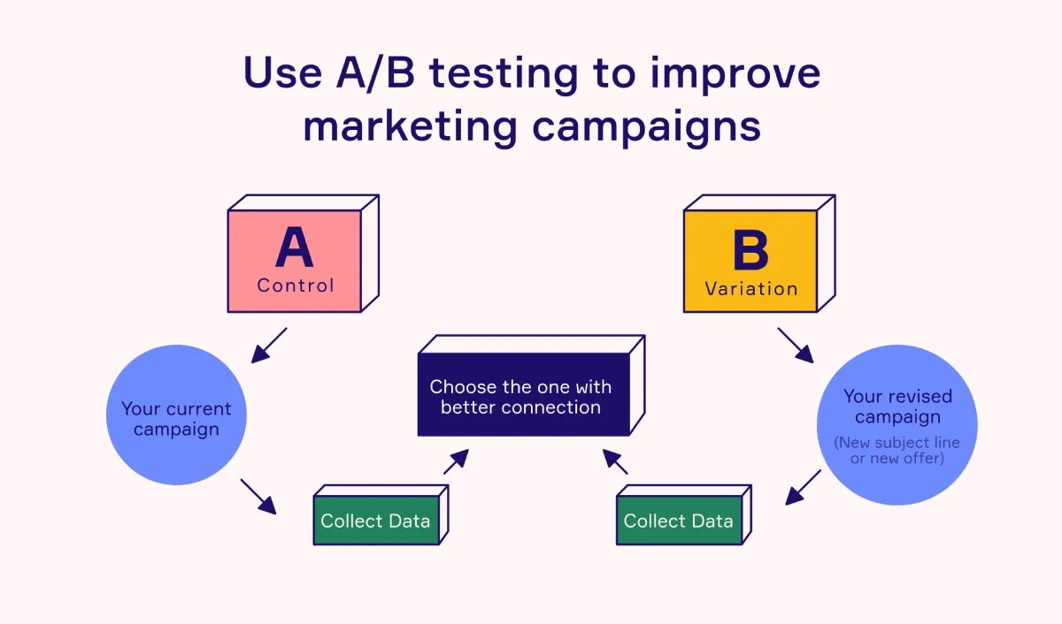
A/B testing compares a control version with a treatment version. It is useful when traffic volume is adequate, the change can be isolated, and a team needs evidence about cause and effect.
Multivariate testing evaluates combinations of several elements. It can be useful for high-traffic pages, but it requires considerably more traffic, as each combination needs sufficient exposure. Small businesses will often learn faster from a focused A/B test or a usability study than from a complex multivariate experiment.
Before launch, define:
- The primary metric and guardrail metrics.
- The expected minimum detectable effect, meaning the smallest improvement worth detecting.
- The estimated sample size and test duration.
- The audience included in the test.
- The stopping rule.
Stopping rules deserve more attention than they get. Ending a test after an early spike can produce a misleading result. Visitor behavior changes by day of week, device mix, campaign activity, and season. Running tests in full-week increments can reduce some timing distortion, but the duration should still reflect traffic volume and the effect size the business needs to detect.
Do not assume statistical significance alone proves a commercially valuable outcome. A small increase in low-margin orders could be less valuable than a stable conversion rate with higher average order value. The final decision should consider incremental revenue, margin, fulfillment capacity, lead quality, and customer retention where data is available.
Know When Not To Test
Not every decision needs an experiment. Testing a clearly broken form, unreadable error text, or inaccessible navigation can delay an obvious fix. Likewise, a site with very low traffic may take months to collect enough data for a reliable A/B result.
In these cases, use a different decision method:
- Conduct five to eight moderated usability sessions around the conversion task.
- Review form completion behavior and support questions.
- Make low-risk usability corrections that remove clear obstacles.
- Track before and after performance over a defined period, while noting major campaign or seasonal changes.
This is weaker causal evidence than a clean experiment. It can still be responsible decision-making when the alternative is waiting indefinitely for traffic that does not exist.
Keep an experiment log. Record the hypothesis, implementation details, dates, traffic sources, results, and what changed in the team’s understanding. A null result is not wasted effort if it prevents the same weak idea from returning every quarter.
Connect CRO To Brand Trust
Conversion is rarely isolated from brand perception. Decision makers evaluating a financial adviser, real estate firm, consultant, or specialized provider are assessing risk as much as functionality. Inconsistent visuals, generic messaging, thin proof, and unclear next steps can make a capable firm appear less established than it is.
That is why CRO should work alongside positioning. Useful brand strategy insights can help leaders identify the claims, proof points, and buyer concerns that a website must communicate before asking for a conversion.
The goal is not to pressure visitors into clicking. It is to make the next step feel clear, credible, and proportionate to the decision at hand.
Conclusion
Website conversion rate optimization is a management discipline, not a collection of design tricks. We achieve better outcomes by defining the conversion unit, measuring the full journey, investigating friction points, and making decisions that protect lead quality and profit.
Start with one high-value path: a service inquiry form, a checkout, or a consultation booking flow. Verify the measurement, identify the largest obstacle, and make one evidence-based improvement. That approach creates a more credible website and a stronger basis for growth.
Contents
Frequently Asked Questions
What Is Website Conversion Rate Optimization?
Website conversion rate optimization is the process of improving the share of a defined audience that completes a desired action. It combines analytics, UX review, user research, content improvements, and controlled testing to reduce friction and increase meaningful outcomes.
Should I Use Users, Sessions, Or Visitors As The Denominator?
Use the denominator that matches the decision. Use unique users when measuring how many people convert after seeing a page. Use sessions when repeated visits are part of the customer journey. Use funnel entries, such as checkout starts, when assessing a specific process. Keep the choice consistent when comparing performance.
What Conversion Should My Website Optimize First?
Start with the conversion closest to business value that has enough volume to measure. For ecommerce, this is often the number of completed orders and profit per visitor. For B2B services, it may be qualified leads or booked meetings that meet clear fit criteria. Track microconversions as supporting signals, not as the only goal.
How Do I Find Where Visitors Abandon My Funnel?
Map the key steps from entry to conversion, then measure the percentage of users who move from one step to the next. Review the largest drops by device, traffic source, and landing page. Use recordings, surveys, and usability testing to understand the reason behind the drop before changing the page.
How Much Traffic Do I Need For A Reliable A/B Test?
It depends on your baseline conversion rate, desired minimum detectable effect, traffic volume, and chosen confidence threshold. There is no single visitor count that works for every site. If traffic is limited, prioritize stronger research, clear usability fixes, and larger changes over minor button tests.
Why Did Conversions Increase While Lead Quality Fell?
The page may have reduced qualification too aggressively. For example, removing all form fields can increase submissions from people outside your service area or budget range. Add guardrail metrics such as sales-accepted leads, meeting attendance, average order value, refunds, or pipeline value to identify this trade-off.
Is CRO Different From UX Optimization And SEO?
They overlap but have different primary aims. SEO helps qualified people find the site. UX optimization helps them use it effectively. CRO focuses on increasing a defined conversion outcome. The strongest programs coordinate all three, because traffic that cannot find relevant information or complete a task will not convert reliably.
More on Websites & UX

Websites & UX
UX Design for Small Business Websites That Converts
Prioritize the customer task that matters most to revenue. Build each page around that task, test the complete journey on a real phone, confirm that forms and notifications work, and measure completed actions instead of judging UX by appearance alone.

Websites & UX
How to Brief a Web Designer Without Costly Surprises
A strong web design brief defines the business objective, audience, page priorities, content ownership, functional requirements, technical constraints, approval process, and success measures. It should also state what is not included, who decides, and how changes will be handled after approval.

Websites & UX
Small Business Website Design That Builds Trust and Leads
A professional website for a small business should have one primary conversion goal, clear page-level messaging, responsive mobile design, accessible interactions, fast-loading pages, and an ownership plan for ongoing updates. Design is most effective when it supports a measurable business decision, not just a visual refresh.