UX Design for Small Business Websites That Converts
Prioritize the customer task that matters most to revenue. Build each page around that task, test the complete journey on a real phone, confirm that forms and notifications work, and measure completed actions instead of judging UX by appearance alone.
 By Tabitha Ayers9 min read
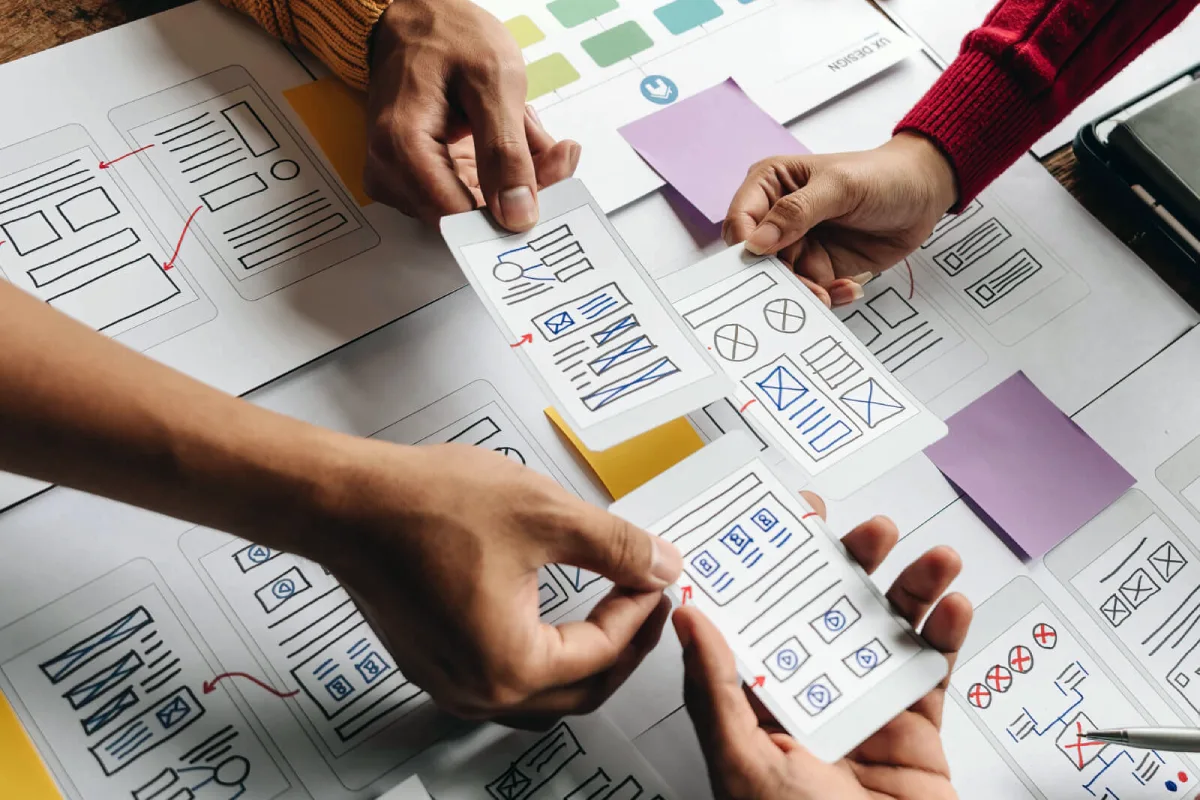
UX Design for Small Business Websites is not about making a site look modern for its own sake. It is about helping a visitor understand your business, find the right information, and complete a useful action without friction.
For a small business, that action may be requesting a quote, booking a consultation, calling a location, buying a product, or submitting a contact form. Even if visitors can complete that task quickly, a polished website can still underperform.
The practical goal is simple: make the next step obvious, credible, and easy on every device. I recommend starting with the customer journey and operational details before considering a large visual redesign. A broken form, confusing service page, or missing confirmation message can cost more opportunities than an outdated color palette.
Start With the Highest Value Customer Task
UX is the overall experience of using a website: how easily someone can understand the offer, find information, and finish a task. UI is the visible interface: type, colors, buttons, images, and layout. Both matter, but UI cannot compensate for a weak user journey.
VistaPrint’s UX guidance for small-business sites makes the same distinction and connects good UX to hierarchy, mobile usability, accessibility, clear CTAs, and task-based testing.
For decision-makers, the useful question is not “What pages should our website have?” It is, “What should the right visitor accomplish first?”
Rank Website Actions by Business Value
Most small businesses serve several visitor needs. A commercial real estate firm may want leasing inquiries, investor conversations, and recruiting applications. A consulting firm may want discovery calls, newsletter signups, and case study views. These actions do not have equal value.
Create a short priority list before changing templates or writing copy.
Visitor Action | Business Value | UX Priority | Typical Failure Point |
|---|---|---|---|
Request a qualified consultation | High | Primary | Vague value proposition or long form |
Call a local office | High | Primary for mobile | Phone number is hard to find or tap |
Book an appointment | High | Primary | Scheduling steps feel uncertain |
Download a guide | Medium | Secondary | Gated too early or weak reason to download |
Read company news | Low to medium | Supporting | Competes with conversion content |
A practical approach is to select one primary homepage action. This does not mean removing every other option. It means giving the most valuable action the strongest visual priority, clearest wording, and shortest path.
For example, a wealth advisory firm may place “Schedule a Private Consultation” in its main navigation and hero area, while “Explore Our Approach” remains a secondary option. That structure respects visitors who need more research while still guiding ready prospects toward a conversation.
Run a Thirty-Second Comprehension Test
Before planning a redesign, test whether the site makes sense at first glance. A small-business website discussion on Reddit recommended asking what a visitor should achieve within 30 seconds; this 30-second visitor objective test is a useful, low-cost starting point.
Ask a person who does not know your business to briefly look at the homepage, then close it. Ask them these questions:
- What does this company do?
- Who is it for?
- Why might someone choose it?
- What would you do next if you needed help?
If they cannot answer clearly, do not start with animation or new photography. Repair the message, hierarchy, and CTA first.
Align Information Architecture With Buyer Questions
Information architecture is simply the way pages and labels are organized. It becomes a UX problem when a visitor has to guess where services, pricing context, locations, credentials, or contact options live.
A professional services firm often needs fewer top-level navigation items than it assumes. Visitors generally need to understand the service, the relevant proof, the people behind it, and the next step. A menu full of internal business categories may make sense to the organization but not to a prospective buyer.
Use customer language in navigation labels. “Services” may work when the offering is straightforward. When buyers search for a specific outcome, a clearer label such as “Investment Advisory,” “Commercial Property Services,” or “Consulting Capabilities” may reduce uncertainty.
Build Conversion Paths That Reduce Friction
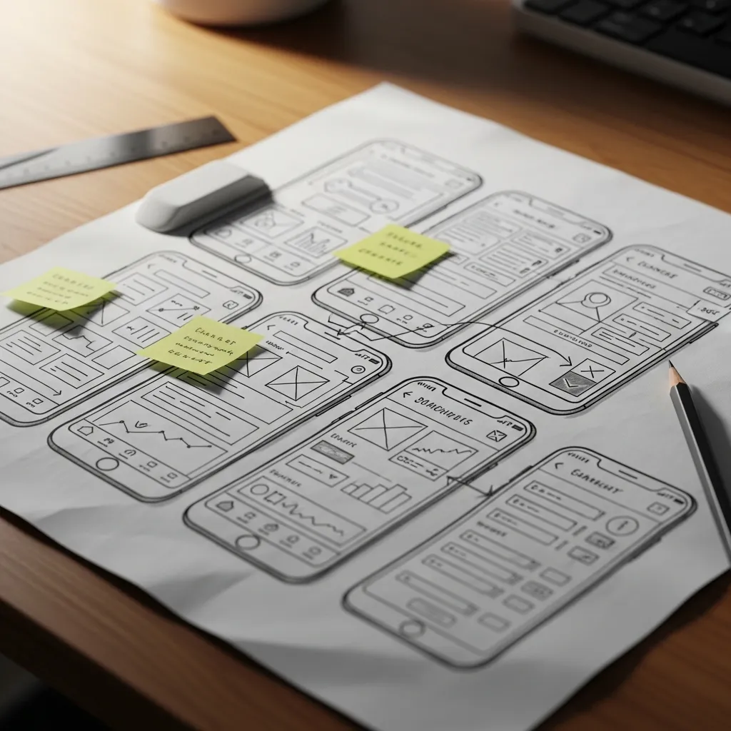
A conversion path is the sequence from landing on a page to completing an action. Good UX removes questions at each stage: Is this for me? Can I trust this business? What happens if I click? Did my request go through?
A strong path is not necessarily short. A complex B2B decision may require proof, expertise, and several pages before a visitor is ready to inquire. The goal is not fewer clicks at all costs. The goal is fewer confusing or unnecessary steps.
Design Pages Around Intent, Not Internal Departments
Different pages serve different states of readiness.
Visitor State | What They Need | Useful Page Elements | Avoid |
|---|---|---|---|
Early research | Fast understanding and relevance | Clear headline, short service summary, proof points | Dense company history before the offer |
Comparing options | Differentiation and confidence | Process, credentials, examples, FAQs | Generic claims without evidence |
Ready to act | Low effort and certainty | Clear CTA, concise form, response expectations | Hidden contact details or unclear next steps |
Consider a management consulting firm that receives leads from referral partners and search. Referral traffic may be ready to book a conversation. Search visitors may first need to understand the firm’s speciality and view proof of expertise. Both paths can lead to the same consultation CTA, but the page content should meet the visitor where they are.
This is where small business website design should be treated as a business system rather than a collection of attractive screens. The right layout depends on the decision a visitor is trying to make.
Make Forms Earn Their Questions
Form friction occurs when a visitor is asked for too much information, does not understand why it is needed, or cannot tell whether submission worked.
WolfPixel’s overview of UI and UX expectations for small businesses recommends task-first prioritization, meaningful field labels, real device testing, confirmation testing, and caution about treating automated accessibility tools as complete solutions.
Use labels that remain visible above or beside fields. Placeholder text alone can disappear when someone starts typing, forcing the visitor to remember what information belongs in the field. Ask only for what is needed at that stage.
For a consultation request, a practical first form may include:
- Name
- Work email
- Company name
- Brief description of the need
- Preferred contact method
Avoid asking for budget, employee count, mailing address, job title, and detailed project scope unless that information directly affects qualification. A longer form can be appropriate for a formal RFP process, but it is usually a poor choice for an initial inquiry.
Treat Confirmation as a Required Page State
The confirmation state occurs after a visitor submits a form, books a meeting, or places an order. It is easy to overlook because the business owner already knows the system is supposed to work.
A useful confirmation should answer three things:
- Did the action succeed?
- What happens next?
- What should the visitor do if they do not receive a response?
For example: “Your consultation request has been received. A team member will respond within two business days. If your matter is urgent, call [phone number].” This is more reassuring than a generic “Thank you.”
Fair warning: the visible confirmation is only half the experience. A form that displays success but fails to reach the right inbox is a UX failure and an operational failure.
Make Mobile Accessibility and Reliability Part of UX
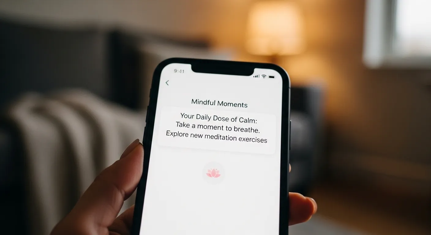
Responsive design adjusts a layout to different screen sizes. Mobile usability goes further: it asks whether a person can actually read, tap, type, choose dates, make a payment, or submit a request on a phone.
Desktop review alone will not reveal every problem. A page can look fine in a browser preview but become difficult to use when someone uses one hand, has a slower connection, or is on a small screen.
Test the Entire Journey on a Real Device
A Reddit small-business review highlighted the value of testing mobile browsing, first-time sign-up, form delivery, and loading under mobile data conditions. Use this end-to-end mobile testing scenario as a reminder that a functional-looking form is not enough.
Test your primary conversion path under realistic conditions:
- Open the site on a phone without using a saved login.
- Find the main service or product from the homepage.
- Use the menu, search, filters, or location tools as a first-time visitor would.
- Complete the quote, booking, purchase, or contact flow.
- Check the confirmation message, confirmation email, internal notification, and follow-up process.
If any step fails, fix it before adding design polish. A redesigned hero section cannot offset a booking calendar that breaks on mobile.
Test Accessibility Through Completion, Not Appearance
Accessibility supports visitors who use keyboards, screen readers, zoom tools, captions, or different input methods. It also improves clarity for many other users.
Logoworks’ accessibility guide for small businesses emphasizes testing keyboard navigation, focus indicators, headings, labels, alternative text, and the ability to complete real tasks rather than relying only on visual review.
A Practical Manual Check
Use the Tab key to move through a page without using the mouse. You should be able to see where focus is at all times, open menus, enter form fields, select controls, and submit the form. If focus disappears, gets trapped in a pop-up, or skips a key control, the journey is incomplete.
Accessibility overlays and automated scans may help identify some issues, but they do not prove that a website is fully accessible or compliant. This depends on the site, the visitor task, and applicable legal requirements. For example, a scan may flag contrast but miss that a keyboard user cannot complete a booking widget.
Protect Performance and Trust
Visitors often interpret friction as risk. A slow page, a broken image, an unclear privacy note, or an unexpected error can make a credible business seem less dependable.
Start with the practical causes:
- Compress oversized images before upload.
- Remove plugins, pop-ups, and scripts that do not support a customer task.
- Keep contact details, business location, and service availability accurate.
- Check that testimonials, credentials, policies, and case studies are up to date.
- Make phone numbers and email links usable on mobile devices.
Trust signals work best near the decision they support. A testimonial beside a consultation CTA can reduce doubt at the moment of action. A list of certifications on an unrelated page may have less impact.
Choose Cost-Effective UX Improvements
Small businesses do not need to fund a complete redesign every time performance is weak. The right investment depends on the severity of the issue, the value of the affected action, and the limits of the current platform.

Fix Before You Rebuild
Choose targeted improvements when the core site is technically stable, and the main problems are clear. Examples include rewriting a vague homepage message, simplifying navigation, improving a form, adding a stronger confirmation state, or correcting mobile spacing.
Choose a partial redesign when the business has changed position, added services, or needs a new conversion path but can retain its existing content structure and technology.
Choose a full redesign when the platform cannot support reliable mobile behavior, accessibility improvements, secure integrations, or the business’s current positioning. A full rebuild may also be appropriate when navigation and page structure are fundamentally disconnected from how customers buy.
There is no universal rule for when a website builder is sufficient. For a local service business with a focused offer and simple booking needs, a well-configured template may be enough. For a B2B firm with complex service pages, strong credibility requirements, integrations, and multiple audiences, template limits may create ongoing friction.
Use a Lightweight UX Audit
A useful audit does not need a large research budget. Start with a page and task inventory.
Audit Area | Question to Ask | Low Cost Fix | Escalate When |
|---|---|---|---|
Message clarity | Can a new visitor explain the offer? | Rewrite headline and page hierarchy | Positioning is unclear across the business |
Navigation | Can users find priority information? | Rename, reorder, or remove menu items | Content structure is deeply fragmented |
Conversion path | Can users finish the main action? | Simplify CTA, form, and confirmation | Booking, payment, or CRM system fails |
Mobile usability | Can users tap, read, and submit? | Adjust spacing, font size, and controls | Template breaks across core pages |
Accessibility | Can users operate key tasks with a keyboard? | Correct labels, focus, headings, and contrast | Custom components remain inaccessible |
When the issue spans strategy, content, design, and technical delivery, professional web design services can help turn the audit into a coordinated plan instead of a series of disconnected fixes.
Measure Outcomes Instead of Preference
A design review often focuses on subjective comments such as “It feels cleaner” or “The button should be bigger.” Those observations can be useful, but they should not be the final decision rule.
Track whether visitors complete the business action you prioritized. Depending on the model, this may include completed inquiry forms, qualified calls, booked appointments, completed checkouts, successful account signups, or directions requests.
Also track failures. Review incomplete forms, booking errors, spam submissions, unanswered inquiries, broken confirmation emails, and mobile-only complaints. A lower volume of inquiries is not always a UX problem, but a rising number of failed submissions or confused calls is a strong reason to inspect the journey.
Conclusion
Effective UX Design for Small Business Websites makes a business easier to choose and easier to contact. Start with the visitor task that has the greatest commercial value, remove barriers from the path, and verify that every technical step works after the visitor clicks submit.
A website does not need more features to perform better. It needs clearer priorities, credible information, reliable interactions, and a user journey that respects the visitor’s time.
Contents
Frequently Asked Questions
What Does UX Design Mean for a Small Business Website?
UX design means making the website easier to understand and use. For a small business, it centers on whether visitors can find the right service, evaluate trust, and complete an action such as calling, booking, buying, or requesting a quote.
How Is UX Different From UI or Visual Web Design?
UI is the interface people see and interact with, including colors, typography, buttons, and layouts. UX includes the full journey: message clarity, navigation, mobile behavior, forms, confirmations, and the business process that follows a submission.
What Should the Homepage Help Visitors Do First?
The homepage should help visitors understand the offer and move toward the highest-value next step. For many B2B firms, that is a request for a consultation. For a local business, it may be making a call, getting directions, or booking an appointment.
How Can I Tell Whether My Navigation Is Confusing?
Ask someone unfamiliar with the business to find a service, a contact method, and a proof point such as a testimonial or credential. If they hesitate, choose the wrong label, or repeatedly return to the homepage, simplify the menu and rename items in customer-friendly language.
What Makes a Contact Form Easy to Complete?
A good contact form asks only for the information needed now, uses persistent labels, works on a phone, shows clear errors, and provides specific confirmation after submission. Test whether the lead also reaches the correct internal inbox.
Should I Improve My Existing Site or Rebuild It?
Improve the existing site when the platform works and the problems are limited to content, hierarchy, forms, or mobile refinements. Rebuild when the platform blocks reliable task completion, accessibility improvements, integrations, or the business’s current positioning.
Which Metrics Show That UX Improved?
Focus on completed business actions: submitted forms, booked meetings, calls, purchases, and qualified leads. Review supporting signals such as form errors, abandoned booking steps, mobile complaints, failed notification emails, and response times.
More on Websites & UX

Websites & UX
Website Conversion Rate Optimization That Drives Better Leads
Website conversion rate optimization works best when we define the right conversion first, identify friction with data and user research, test one clear hypothesis at a time, and judge results by lead quality, revenue, and profit rather than clicks alone.
Websites & UX
Small Business Website Design That Builds Trust and Leads
A professional website for a small business should have one primary conversion goal, clear page-level messaging, responsive mobile design, accessible interactions, fast-loading pages, and an ownership plan for ongoing updates. Design is most effective when it supports a measurable business decision, not just a visual refresh.

Websites & UX
WordPress vs Squarespace vs Wix: Choose With Confidence
Choose Wix when speed and beginner-friendly editing matter most. Choose Squarespace when you want a polished, controlled visual system with less setup. Choose self-hosted WordPress when your business needs deeper customization, ownership, content growth, or flexibility beyond a standard website builder. The right answer depends on what would be hardest and most expensive to change later.