10 Website Design Trends Small Businesses Should Watch in 2027
The strongest 2027 website design direction combines clear, answer-first content with distinctive visual craft. Prioritize semantic structure, accessible interaction, mobile speed, and purposeful personalization before investing in 3D scenes, scroll effects, or complex animation.
 By Tabitha Ayers9 min read
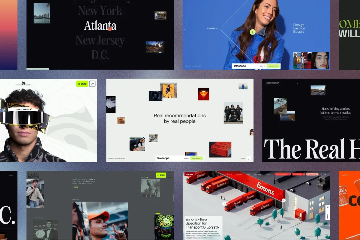
The most useful website design trends for 2027 will not be the loudest visual effects. They will be the choices that help a small business explain its value faster, earn trust sooner, and make the next step easy on any device.
For decision makers, that distinction matters. A dramatic homepage can create attention, but it can also bury the service offering, slow down mobile users, or make the company appear less credible. I recommend treating trends as tools, not requirements. The right trend should support a real business task: booking a consultation, comparing services, requesting a quote, reviewing proof, or purchasing.
The 10 Website Design Trends To Watch In 2027
1. AI-Ready, Answer-First Content
Websites are moving away from vague marketing copy and toward pages that state the answer early. A visitor should not need to scroll through a long brand statement to learn what a business does, who it serves, where it operates, and how to take action.
This approach also makes content easier for assistive technology, search systems, and emerging AI agents to interpret. Use semantic HTML such as proper heading levels, lists, tables, buttons, labels, and descriptive links. Add structured data where it accurately represents services, products, locations, reviews, events, or FAQs.
For example, a commercial real estate advisory firm could lead a service page with: “We help Texas property owners evaluate acquisition, disposition, and leasing opportunities.” It can then explain the process, show relevant transactions or credentials, and place a consultation action near the decision point.
Avoid turning every page into a wall of FAQ text. Answer first does not mean stripped of personality. It means the visitor can understand the offer before encountering the supporting story.
2. Hyper Personalized User Experiences

Personalization can make a website more useful when it responds to known intent. A visitor arriving from a wealth management campaign may need different proof points than someone exploring executive planning services. A returning customer may benefit from saved preferences, account shortcuts, or relevant resources.
The mechanism should stay simple: use declared information first, such as selected industry, service interest, account type, or location. Then offer a clear fallback for people who do not consent to tracking or whose data is incomplete.
A practical hierarchy looks like this:
- Declared personalization: A visitor chooses a market, role, location, or need.
- Contextual personalization: The site adjusts content based on the page, campaign, or referral source.
- Behavior based personalization: The site adapts based on prior actions, with appropriate consent and privacy controls.
Fair warning: personalization fails when it feels like surveillance. Avoid copy that reveals an uncomfortable level of inference, such as calling out a visitor’s employer or repeatedly following them with the same message. If a recommendation is wrong, the interface should remain useful rather than forcing the visitor down a bad path.
3. Conversational Interfaces With A Purpose
AI chat, guided questionnaires, and natural language search are becoming more common. Their value is not that they make a website seem advanced. Their value is helping a visitor complete a specific task with less friction.
A useful conversational interface can route a prospect to the right service, gather details before a consultation, compare product options, or help a customer find a policy document. It should not replace clear navigation or become a dead end that gives generic answers.
Design the conversation around known tasks. For instance, a professional services website could offer three starting paths: “Find the right service,” “Prepare for a consultation,” and “Explore industry expertise.” Each path should include a visible exit to standard navigation and a way to contact a person.
Use careful governance. Explain when visitors are interacting with automation, limit the collection of sensitive data, and establish a human escalation route. If the system cannot answer confidently, it should say so plainly rather than produce an authoritative-sounding guess.
4. Editorial, Asymmetric Layouts
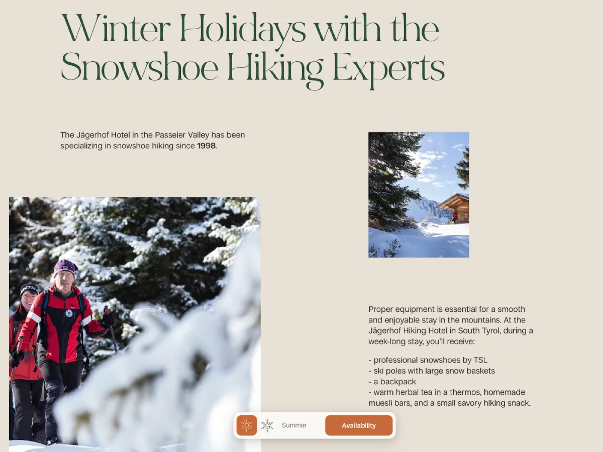
Template-based card grids are efficient, but they can make very different companies look interchangeable. In 2027, more small businesses will use editorial composition to create stronger hierarchy: confident headlines, intentional whitespace, large imagery, uneven columns, and selective overlap.
Asymmetry works when it directs attention. A left-aligned service statement, paired with a narrow proof column, can guide a visitor from the value proposition to evidence to action. A large image can set tone, while a smaller content block explains the offer without competing for attention.
It does not work when visual imbalance becomes confusion. On mobile, asymmetric desktop layouts often need to be simplified to a straightforward single-column reading order. The design should preserve sequence, not force users to hunt for the next section.
For firms evaluating a broader change, website redesign services should begin with content priorities and conversion paths rather than a request to make the layout feel more modern.
5. Large, Kinetic Typography
Typography is increasingly carrying the visual identity once assigned mainly to photography or illustration. Oversized type, variable fonts, expressive line breaks, and restrained kinetic movement can make a site feel distinctive without requiring massive media files.
Large type must still be readable. Choose typefaces with clear letterforms, maintain sufficient contrast, avoid overly tight line spacing, and test long headlines on narrow screens. A four-word headline may work at a large scale; a twenty-word sentence may not.
Kinetic typography should reinforce meaning. A word that subtly shifts as a service process advances can add emphasis. Constantly bouncing, sliding, or scrambling headlines create distraction and can make reading harder.
A Better Motion Rule
Every moving element needs a static equivalent. If an animated headline reveals the steps of a process, the full process should remain available as normal text when motion is reduced or unavailable. This is not merely a technical fallback. It is a content decision that protects comprehension.
6. Scroll Storytelling That Supports Decisions
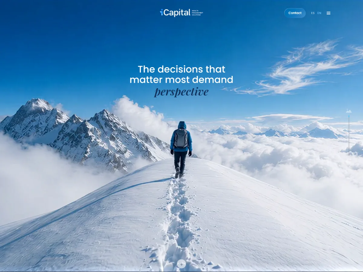
Scroll storytelling uses progressive disclosure: the page reveals information as the visitor moves through a narrative. It can work well for a complex product, a consulting process, a before-and-after transformation, or a technical service that needs explanation.
Consider a manufacturer introducing a configurable product. The first section can state the core benefit. The next can show the operating problem. Later sections can explain configuration options, proof, technical specifications, and a request form. The scroll sequence gives the visitor a logical path rather than presenting every detail at once.
The risk is making scrolling the only way to access information. Avoid scroll hijacking, where the browser’s normal scrolling behavior is overridden. Keep navigation available, provide clear section headings, and ensure essential details are accessible directly via links or menus.
Use cinematic transitions only when they support the story. If a motion effect delays access to pricing, specifications, or contact details, it is not helping the business case.
7. Interactive Product Demos And Tangible Proof
Interactive demos can move a website beyond broad claims. A visitor may rotate a product, compare configurations, estimate a service package, explore a process diagram, or try a sample workflow before speaking with sales.
This trend has strong potential for businesses with complex offers because it reduces uncertainty. A software company can let visitors test a simplified workflow. A construction firm can show phased project delivery. A financial firm can provide an educational planning calculator with clear assumptions and appropriate disclaimers.
Choose the lightest interaction that proves the point. A comparison table may answer a buyer’s question more efficiently than a 3D viewer. WebXR and immersive 3D can fit products where spatial understanding changes the purchase decision, but they are usually excessive for a standard B2B service website.
The core task must remain available without the interactive layer. If a configurator fails to load, visitors should still be able to view specifications, request pricing, and contact the business.
8. Micro Interactions That Earn Attention
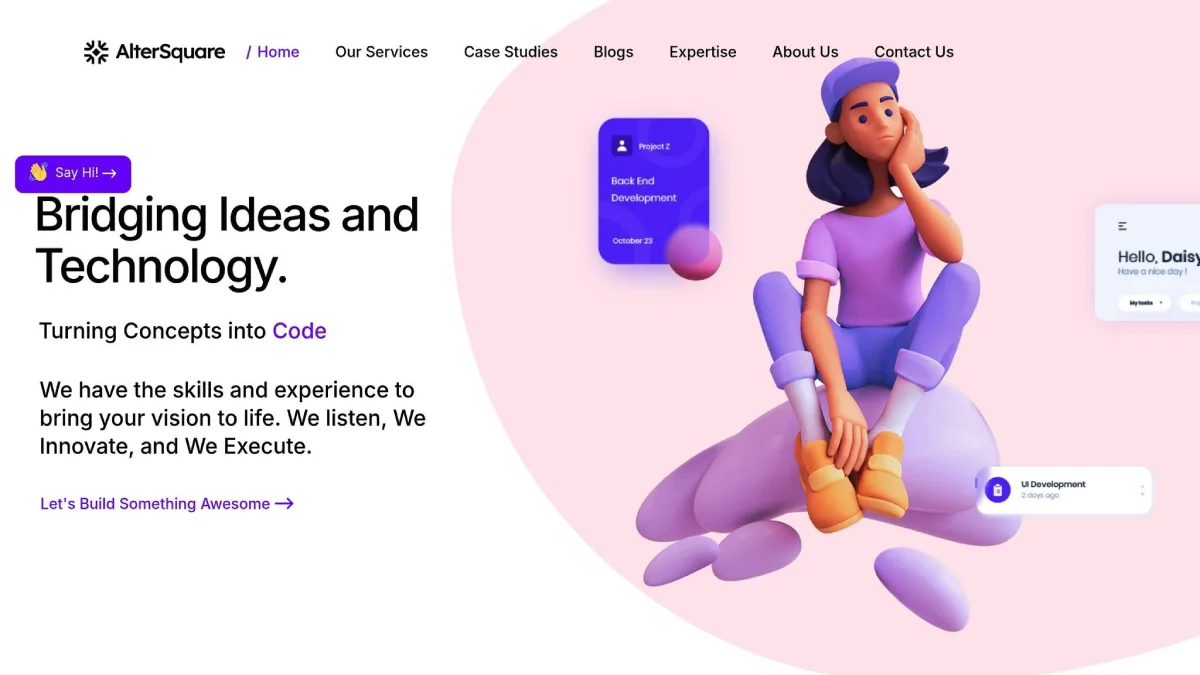
Micro interactions are small responses to user behavior: button feedback, loading cues, form validation, saved state messages, hover changes, and confirmation animations. They can make an interface feel responsive by telling users what happens after an action.
A good example is a quote request form that validates an email address as the user moves to the next field, explains errors in plain language, and confirms submission without leaving uncertainty. That is more useful than an elaborate animation on a decorative icon.
Use micro interactions selectively:
- Confirm an action has succeeded.
- Explain why an action cannot continue.
- Show a system is loading or processing.
- Reveal secondary information without cluttering the page.
- Provide keyboard focus and touch feedback.
Avoid attaching motion to every hover state, card, and image. Too much movement weakens the signal. It can also increase rendering work on lower-powered mobile devices.
9. Accessibility As Visual Craft
Accessibility is increasingly visible in excellent design. It shows up in readable colour contrast, obvious focus states, touch-friendly controls, descriptive error messages, logical heading order, captions, and keyboard navigation.
WCAG provides useful guidance, but compliance should not become a last-minute checklist. A translucent glassmorphism panel may look polished until light text sits over a changing background. A soft neumorphic button may appear elegant until users cannot tell whether it is clickable. A minimal form may look clean until error messages rely only on red text.
Treat accessibility as an early creative constraint. Set contrast standards in the color system. Define focus styles alongside hover styles. Design reduced-motion variants as you plan the animation. Test the primary conversion path with a keyboard before approving the interface.
For organizations building or improving a high-value digital presence, web design services should connect visual direction to usability requirements from the first planning stage.
10. Fast, Mobile-First Performance
Fast performance is the trend that makes every other trend viable. A beautifully designed site loses value if visitors face a slow hero video, delayed navigation, or a form that becomes difficult to use on a phone.
A mobile-first approach starts with the smallest essential experience: core message, proof, primary action, readable text, and functional navigation. Desktop enhancements come after that foundation is in place.
Use a performance budget before production. Set limits for image weight, video use, third-party scripts, font files, and interactive components. Use responsive images, modern image formats, lazy loading for noncritical media, caching, and progressive enhancement. Server-side rendering or static site generation can also support fast, dependable delivery when appropriate.
Sustainable design belongs here too. It is not a leaf icon or an earthy color palette. It is the practical reduction of unnecessary transfers, oversized media, repeated scripts, and costly visual effects.
How To Choose Trends That Fit Your Business
The right website design trend depends on the audience, the task, the device, the brand position, and the risk of failure. A portfolio site may benefit from expressive motion and an unusual layout. A healthcare, legal, financial, or B2B services site often needs clearer proof, faster paths, and a more conservative interaction model.
Use A Trend Scorecard Before You Build
I recommend scoring a proposed trend before it becomes a design requirement. This prevents a visual preference from overriding user needs.
Evaluation Area | Question To Ask | Warning Sign |
|---|---|---|
Accessibility | Can keyboard users, screen reader users, and reduced-motion users complete the same task? | Essential meaning depends on hover, color, or animation. |
Performance | Does the feature fit the mobile performance budget? | The homepage needs heavy media before showing the offer. |
Comprehension | Does it make the service or product easier to understand? | Users need instructions to interpret the interface. |
Conversion | Does it shorten the path to inquiry, purchase, or booking? | The effect adds steps before the primary action. |
Brand Distinctiveness | Does it reflect the company’s actual position? | The design could belong to any competitor. |
Maintainability | Can the team update it without specialized effort? | Routine edits require code changes or expensive assets. |
Test The Trend Against A Neutral Baseline
Trend popularity does not prove business value. The most reliable approach is controlled comparison. Start with a clear baseline page, then test one meaningful change at a time.
For example, a firm could compare a static service page against a scroll-led version. Measure whether visitors reach the contact action, whether they understand the offer in usability sessions, whether the page remains fast on mobile, and whether sales conversations improve in quality. If the scroll story increases time on page but reduces form completion, it may be entertaining without being effective.
No universal benchmark can confirm that a given trend will increase conversion. The outcome depends on traffic quality, offer complexity, trust requirements, and implementation quality. That uncertainty is exactly why testing matters.
Match The Pattern To The Website Type
Website Type | Trends Worth Prioritizing | Trends To Use Carefully |
|---|---|---|
B2B Professional Services | Answer-first content, proof-led layouts, accessible typography, fast inquiry paths | Heavy 3D, hidden navigation, overly playful motion |
Ecommerce | Product demos, comparison tools, personalized recommendations, clear feedback | Intrusive chat, slow visual configurators, forced account creation |
Nonprofit | Storytelling, emotional imagery, accessible donation flows, transparent impact content | Long animations before donation actions |
Portfolio Or Creative Studio | Editorial layouts, kinetic typography, selective motion, distinctive art direction | Effects that hide work samples or reduce usability |
Editorial Or Media Site | Strong hierarchy, modular content blocks, readable type, topic navigation | Layout shifts, excessive ads, visual treatments that interrupt reading |
A small business does not need to adopt every trend to look current. In many cases, a sharper value proposition, more credible case studies, better typography, and faster mobile performance will create more commercial value than a complete visual reinvention. For ongoing perspective, explore insights on websites as you assess which improvements deserve priority.
Conclusion
The most valuable website design trends for 2027 are not about adding complexity for its own sake. They are about making expertise easier to understand, interactions easier to complete, and brands easier to trust.
Start with the visitor’s job. Then choose visual and technical patterns that make that job simpler. A website that is clear, fast, accessible, and distinct will remain relevant long after a single aesthetic trend fades.
Contents
Frequently Asked Questions
What Are The Biggest Website Design Trends Right Now?
The strongest trends include answer-first content, AI-supported personalization, conversational tools, editorial layouts, bold typography, purposeful motion, interactive demos, accessibility first UI and UX, and mobile performance. Their value depends on whether they help visitors complete a task.
Which Website Design Trends Are Likely To Last?
Semantic content structure, accessible design, responsive design, clear typography, performance budgets, and reusable design systems are durable because they solve ongoing usability and maintenance needs. Visual styles such as glassmorphism, maximalism, or nostalgic design may be useful, but should serve the brand rather than define the entire website.
Are Bold Fonts And Oversized Typography Accessible?
They can be. Use readable typefaces, strong contrast, sensible line lengths, responsive sizing, and sufficient line spacing. Avoid placing long text in oversized type or relying on thin letterforms over busy images.
How Can I Use Animation Without Slowing Down My Website?
Limit motion to key moments, use efficient animation techniques, avoid auto-playing heavy videos where possible, and lazy-load noncritical media. Most importantly, provide a reduced-motion experience and ensure the full message remains available without animation.
Is Dark Mode A Good Choice For A Business Website?
Dark mode can support a premium or technical visual direction, especially when offered as a user preference. Test contrast carefully, including form fields, icons, error messages, and images. A dark interface should not become a reason to use low-contrast gray text or unclear buttons.
Are 3D Graphics And WebXR Practical For Small Businesses?
They are practical when spatial exploration helps a buyer understand the product, such as furniture, equipment, property, or a configurable physical item. For many service businesses, well-structured copy, diagrams, photography, and proof points are more efficient and easier to maintain.
How Can I Tell If A New Design Trend Improves Conversions?
Define the desired action first, such as a qualified inquiry, a demo request, a purchase, or a booking. Compare the revised experience against the baseline using analytics, usability feedback, form completion data, and page performance metrics. Review lead quality and volume.
More on Websites & UX
Websites & UX
WordPress vs Squarespace vs Wix: Choose With Confidence
Choose Wix when speed and beginner-friendly editing matter most. Choose Squarespace when you want a polished, controlled visual system with less setup. Choose self-hosted WordPress when your business needs deeper customization, ownership, content growth, or flexibility beyond a standard website builder. The right answer depends on what would be hardest and most expensive to change later.

Websites & UX
Website Conversion Rate Optimization That Drives Better Leads
Website conversion rate optimization works best when we define the right conversion first, identify friction with data and user research, test one clear hypothesis at a time, and judge results by lead quality, revenue, and profit rather than clicks alone.
Websites & UX
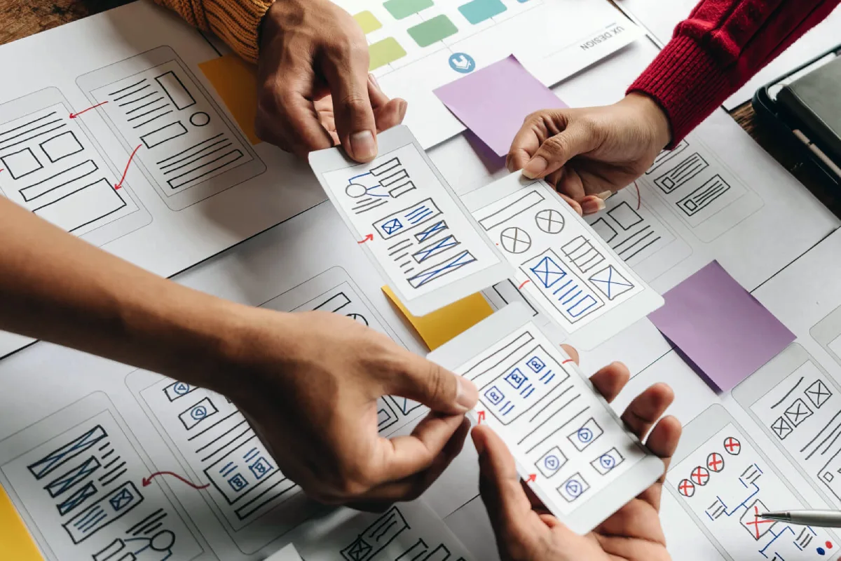
UX Design for Small Business Websites That Converts
Prioritize the customer task that matters most to revenue. Build each page around that task, test the complete journey on a real phone, confirm that forms and notifications work, and measure completed actions instead of judging UX by appearance alone.